In the rush to conquer social media algorithms and email open rates, it is easy to forget that business still happens in the physical world. I’ve walked into countless shops and trade show booths where the owner spent thousands on digital ads, yet their physical storefront or display felt invisible or, worse, unprofessional. There is a tangible weight to a well-crafted sign or a vibrant banner that pixels on a screen simply cannot replicate. It anchors your brand in reality and tells customers you are established, professional, and ready for business.
When you invest in physical marketing, you aren’t just buying ink on paper or vinyl; you are buying the first impression that happens before a customer even speaks to you. At Laguna Digital, we have seen firsthand how the right signage can transform a quiet storefront into a local landmark. Whether it’s a grand opening banner flapping in the wind or a sleek rigid sign in a lobby, these tools work around the clock. They don’t require a click-through rate to be effective; they just need to be seen.
However, getting it right involves more than just slapping a logo on a large sheet of material. I have seen many business owners disappointed because they chose the wrong material for outdoor use or designed a poster with text so small it was unreadable from five feet away. Effective signage requires a blend of strategic design, material knowledge, and a clear understanding of your environment. This guide is written from years of experience in the print shop, helping you navigate these choices to get the best return on your investment.
Why Physical Signage Still Matters in a Digital World
We often hear the question: “Is print dead?” As someone who runs the presses every day, I can tell you the answer is a resounding no. In fact, digital fatigue is real. People can swipe away an ad in a fraction of a second, but they cannot ad-block a massive banner hanging across a busy intersection. Physical signage builds trust because it implies permanence. A business that invests in high-quality digital printing for their signage signals to the community that they are here to stay, not a fly-by-night operation running a quick drop-shipping scheme.
Furthermore, signage serves as a silent salesperson. Think about the last time you walked into a well-organized retail store. The directional signs helped you find what you needed, the promotional posters highlighted deals you didn’t know about, and the checkout signage reinforced the brand identity. If those elements were missing or poorly produced, your experience would have been confusing and frustrating. Good signage reduces friction in the customer journey, guiding them effortlessly from “just looking” to making a purchase.
Choosing the Right Format: Banners, Posters, or Rigid Signs?
One of the most common challenges clients face is simply knowing what product fits their specific need. I’ve had clients ask for a paper poster to be hung outside in the rain, or a heavy vinyl banner for a delicate indoor easel. Understanding the strengths of each format is crucial for longevity and impact. You can explore a wide variety of options in our banners, posters, and signs category, but let’s break down the basics here.
Vinyl Banners: Durability Meets Visibility
Vinyl banners are the workhorses of the advertising world. They are durable, weather-resistant, and incredibly versatile. I usually recommend these for outdoor events, grand openings, or temporary sales. The beauty of vinyl is that it can take a beating from the wind and sun (within reason) and still look vibrant. However, a common mistake is ignoring wind slits or proper grommet placement. If you hang a solid banner in a high-wind area without proper venting, it acts like a sail and can tear itself—or the structure it’s tied to—apart.
Custom Posters: High-Impact Visuals for Interiors
If you are looking to brighten up an office, advertise a concert, or display a menu, posters are your best friend. Unlike banners, posters allow for finer detail and higher resolution because the viewer is usually standing much closer. We often work with artists and photographers who use art reproduction services to turn their original works into stunning poster prints for sale. The key here is paper quality; a flimsy bond paper feels cheap, while a semi-gloss or satin finish on heavy stock elevates the perceived value of the content instantly.
Rigid Signs and Technical Prints
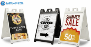
Sometimes you need something that can stand on its own—literally. Rigid signs (like foam board, Coroplast, or aluminum) are essential for permanent displays, real estate signs, or trade show presentations. In the construction and architectural fields, clarity is even more critical. We frequently handle blueprints and architectural diagrams where a single smudge or low-resolution line can cause expensive errors on a job site. For these professionals, the print isn’t just marketing; it’s a vital tool for their trade.
Design Principles That Convert Passersby into Customers
You can print on the most expensive material in the world, but if the design is cluttered, it won’t work. The “less is more” rule is arguably the hardest thing for business owners to accept. I often see designs crammed with three different phone numbers, a website, a physical address, a QR code, and four paragraphs of text. The reality? A driver passing by at 40 miles per hour has about three seconds to digest your message. If they can’t read it in a glance, you’ve wasted your money.
Hierarchy and Readability
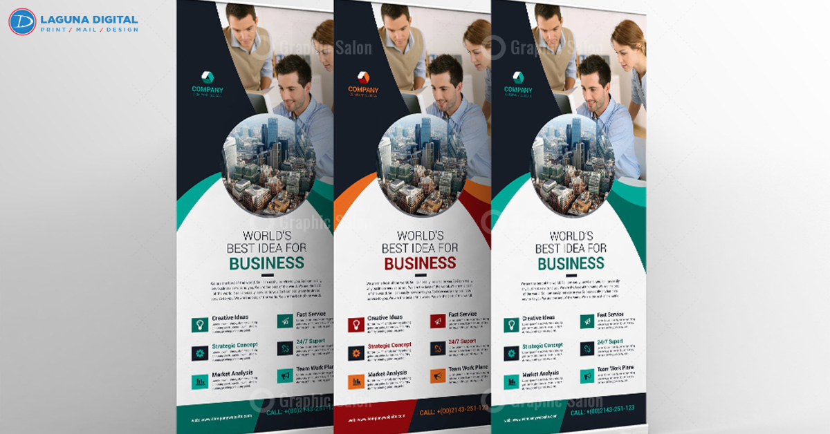
Visual hierarchy is about telling the eye where to look first. Your headline should be the dominant element, followed by a sub-headline or a compelling image, and finally, a call to action. Contrast is also vital. Yellow text on a white background is a nightmare to read, yet we see it submitted frequently. We always advise clients to stick to high-contrast combinations. If you are designing for a distance, remember that thin, script fonts often disappear. Bold, sans-serif fonts are generally the safest bet for readability.
Branding Consistency
Your sign shouldn’t look like it belongs to a different company than your website or your business card. Consistency builds memory. When we help clients with their business essentials, we ensure that the colors (CMYK vs. RGB) are matched as closely as possible across different media. It is jarring for a customer to see a navy blue logo online and a bright purple one on your sign because of a file conversion error. Professional printers know how to manage color profiles to ensure your brand looks authentic everywhere.
Beyond the Sign: Creating a Cohesive Marketing Kit
A sign grabs attention, but what happens once the customer walks in? This is where your collateral material steps in to close the deal. Imagine a trade show booth: you have a stunning backdrop banner that pulls people in. Once they are at the table, you need to hand them something tangible. High-quality business cards are the classic handshake, but don’t stop there.
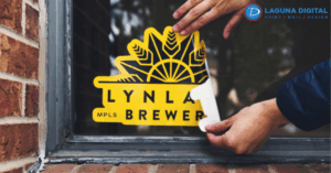
For service-based businesses like salons or clinics, having appointment cards matching your window signage adds a layer of professionalism that encourages repeat visits. If you are selling a complex product or showcasing a portfolio, a single flyer might not be enough. We often see companies pair their large-format displays with book printing services to create catalogs or lookbooks. This combination of “big picture” signage and “detailed info” booklets covers the entire customer interest spectrum.
Common Mistakes When Ordering Custom Signage
Experience is often the result of learning from mistakes—preferably someone else’s! One of the biggest pitfalls we see is image resolution. An image that looks crisp on your smartphone will look like a blurry mosaic when blown up to the size of a billboard. We always recommend using vector graphics (like EPS or AI files) for logos and text, and high-resolution images (at least 300 DPI at full scale) for photos.
Another oversight is ignoring the “bleed” area. If you want your color to go all the way to the edge of the poster, the design file needs to extend slightly beyond the final cut line. Without this, you might end up with an awkward white hairline border around your beautiful design. Finally, spelling errors are more common than you’d think. It is heartbreaking to print a large, expensive banner only to realize “Saturday” is spelled wrong. Always get a second (and third) pair of eyes on the proof before hitting the print button.
FAQs
What is the difference between vector and raster images for signage?
Vector images are made of mathematical lines and curves, meaning they can be resized infinitely without losing quality. They are perfect for logos on large signs. Raster images (like JPEGs) are made of pixels and will become blurry or “pixelated” if you enlarge them too much.
How long do vinyl banners typically last outdoors?
This depends on the weather conditions and sun exposure. Generally, a high-quality outdoor vinyl banner can last anywhere from 2 to 5 years. UV-resistant inks and reinforced hems significantly extend the lifespan, especially in sunny or windy climates.
3. Can I use a photo from my website for a large poster?
Usually, no. Website images are optimized for fast loading and are typically 72 DPI (dots per inch). For printing, we need 300 DPI. Using a web image on a large poster will likely result in a blurry, unprofessional look.
What is the best material for a trade show sign that I need to travel with?
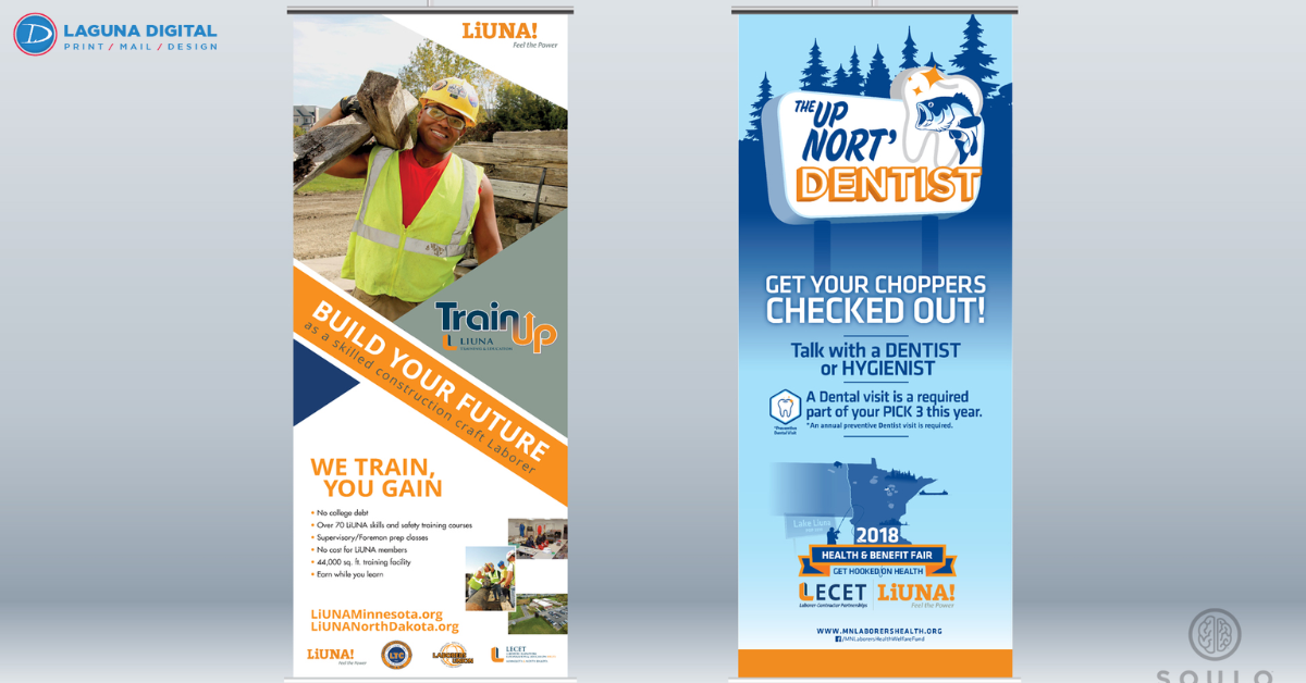
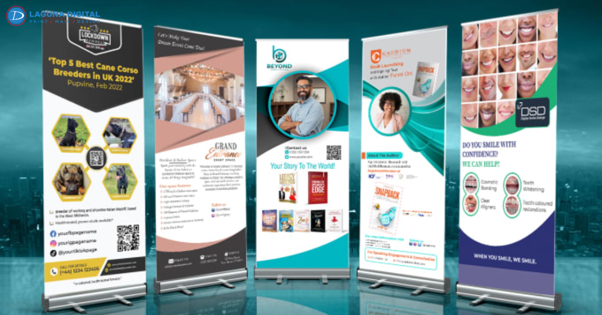
Retractable banners (roll-up banners) are fantastic for travel because they protect the graphic inside the base. Foam board is lightweight but can snap if packed poorly. Fabric banners are also a great option as they can be folded without creasing permanently (if handled correctly).
How do I choose the right size for my sign?
Consider the viewing distance. A good rule of thumb is that for every 10 feet of viewing distance, your letter height should increase by at least one inch. If your sign is 100 feet away from the road, your text needs to be at least 10 inches tall to be legible.
What is “bleed” in printing?
Bleed refers to the area of the design that extends beyond the actual dimensions of the document. It ensures that once the paper is cut to size, there are no unprinted white edges. We usually require a 0.125-inch bleed on all sides.
Is it better to have a glossy or matte finish on my sign?
It depends on the lighting. Glossy finishes make colors pop but can cause glare under bright lights or direct sun, making the text hard to read. Matte finishes reduce glare and are often better for text-heavy signs or brightly lit environments.
Conclusion
Navigating the world of custom printing can feel overwhelming, but the impact of a well-executed sign is undeniable. It is a one-time investment that continues to pay dividends by building brand awareness and guiding customers to your door day after day. Whether you need a simple poster for a community event or a comprehensive suite of banners and architectural blueprints, the goal is always the same: clear communication and professional presentation.
At Laguna Digital, we pride ourselves on helping businesses translate their digital ideas into physical reality. We understand that your signage is an extension of your reputation. By focusing on quality materials, smart design, and the right strategic placement, you can ensure that your business stands out in a crowded marketplace. If you are ready to start your next project or just need some advice on materials, check out our blog for more insights or reach out to us directly. Let’s make something great together.


